Using Labels Inside Text Field, Is That Wrong?
Feb 5, 2013
Today, I got the chance to read the article Don’t Put Labels Inside Text Boxes (Unless You’re Luke W). In that article, Caroline tries to address the problem of using anything inside a text box. Whether it is label or hints. This really pulled me to write this article. I don’t exactly remember when I met the first form with labels inside the text box, but since then I have been fan of labels inside text fields both as an user and designer.
I strongly believe designing doesn’t have any holy rules that has to be kept by all the generations. With the advent of mobile and tablets, the design of web forms started to change. Anything in design is acceptable when the people have the mindset of accepting it. People already started to accept label inside text fields in mobiles. Once they are accepting there, designers tries to bring the same to general web too. Users need not be taught again.
When the form is so big and it is regarding specific business needs, designers will not be interested in placing the labels inside the text field. But hints can be placed and they are not a hindrance either. People are easily making out hints and designers help them do so with dull colored hint text, italic text, hide on click techniques.
Moreover, increase in the number of tablets has also to be kept in mind. Tablets are having fingers as pointers, not mouses and so slightly bigger text boxes will be easy to select. Bigger text boxes take the spaces of the label and so labels come inside text boxes. I think this trend will reflect in more number of websites as the tablet population increase.
Caroline also mentioned,
If you’re presenting a form that people will use a lot or a form that follows a very familiar pattern—such as user name and password—users can sometimes learn what goes where and ignore the labels. This is somewhat similar to the way that people have learned to ignore another Web annoyance, the intrusive banner.
Does people really feel using labels inside text equal to intrusive banner? or even annoyance? I don’t think so. Instead I see them enjoying rich designs.
When designers try to make signature look and feel, some rules are broken. But this helps to enhance user experience and not disturb it.
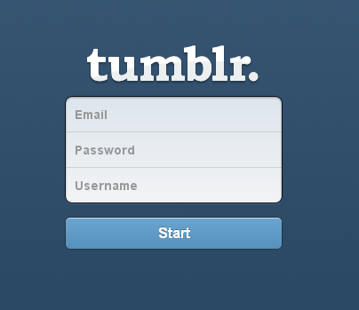
Tumblr and Twitter are two example for making perfect use of labels inside text boxes.