Create Your Own Autocomplete Using Vue.js 2
Jul 6, 2017
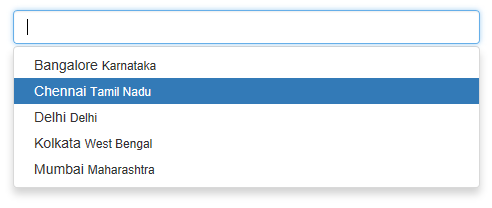
Why should we make our own Autocomplete component when there is plenty of existing components out there? For simple use cases, yes that serves enough. But when you want to create complex ones, like the one which shows Movies in IMDB, its always good to create our own component to have the best control over the design we provide. This article will help with that. We are going to make the an Autocomplete as shown below.
Thanks to vue-cli, we can just jumpstart the setup using the following command
in the command prompt.
vue init webpack autocomplete-v2
cd autocomplete-v2 && npm install
npm run dev
Let’s first decide how the interface/usage of the component should look like.
<autocomplete :suggestions="suggestions" v-model="selection"> </autocomplete>
So we have to bind the suggestions Array to the suggestions property and the
selected value will be passed to v-model from the child component and stored
into selection which is a data in parent component.
Two-way binding is not allowed in Vue 2 and so we have to use v-model which
will update the value of the property in the parent component, when input
event is emitted from the child component. We will see that in detail later.
Now, you can create a new file named Autocomplete.vue and start creating the
component. Let’s first create the props based on the interface we decided
earlier.
<script>
  export default {
    props: {
      value: {
        type: String,
        required: true,
      },

      suggestions: {
        type: Array,
        required: true,
      },
    },

    // data section here
  };
</script>
The value property will be used by v-model while using the component
in the parent component. If we have to use v-model for a component, then it
must have a value property and emit input event. v-model is just a
syntactic sugar for handling the event and updating the property in the
parent component. You can read more on this on Vue’s
documentation.
The suggestions here is going to be an array of objects. Why it’s an array of
objects and not just an array of strings? Most of the complex autocompletes
requires to show more than a string in the suggestion. More information like
images, are displayed in the suggestions. So we are grouping them into an
object. You have to decide the list of properties in this object based on your requirement.
In our case, we are going to have an autocomplete for cities. So, we will show one additional information: state in which the city is present.
{
    'city': 'Chennai',
    'state': 'Tamil Nadu'
}
We will need two data variables in the component.
data () {
  return {
    open: false,
    current: 0
  }
}
open holds the information whether the suggestion box is open or closed, and
current holds the index of the suggestions currently in focus.
Now it is time to define the template section. I just deferred this to make sure we understand the data required for the component when creating the template.
<template>
  <div style="position:relative" v-bind:class="{'open':openSuggestion}">
    <input
      class="form-control"
      type="text"
      :value="value"
      @input="updateValue($event.target.value)"
      @keydown.enter="enter"
      @keydown.down="down"
      @keydown.up="up"
    />
    <ul class="dropdown-menu" style="width:100%">
      <li
        v-for="(suggestion, index) in matches"
        v-bind:class="{'active': isActive(index)}"
        @click="suggestionClick(index)"
      >
        <a href="#"
          >{{ suggestion.city }} <small>{{ suggestion.state }}</small>
        </a>
      </li>
    </ul>
  </div>
</template>
Here I’m just using Bootstrap’s styles for displaying the suggestion dropdown.
If you closely see, you will see names like openSuggestion, matches which
we neither defined in properties and nor in data section. So where are these
coming from? These are Computed Properties, which are kind of derived
properties from other properties/data with some logic.
So we are going to define them.
 computed: {
   // Filtering the suggestion based on the input
   matches () {
     return this.suggestions.filter((obj) => {
       return obj.city.indexOf(this.value) >= 0
     })
   },

   openSuggestion () {
     return this.selection !== '' &&
            this.matches.length !== 0 &&
            this.open === true
   }

 },
matches has the logic which filters the suggestions based on the text in the
input field and openSuggestion returns a true or false based on few
conditions that checks if the suggestion dropdown should be open or not.
Now comes the methods section, which has the actual logic and event handling.
methods: {

  // Triggered the input event to cascade the updates to
  // parent component
  updateValue (value) {
    if (this.open === false) {
      this.open = true
      this.current = 0
    }
    this.$emit('input', value)
  },

  // When enter key pressed on the input
  enter () {
    this.$emit('input', this.matches[this.current].city)
    this.open = false
  },

  // When up arrow pressed while suggestions are open
  up () {
    if (this.current > 0) {
      this.current--
    }
  },

  // When down arrow pressed while suggestions are open
  down () {
    if (this.current < this.matches.length - 1) {
      this.current++
    }
  },

  // For highlighting element
  isActive (index) {
    return index === this.current
  },

  // When one of the suggestion is clicked
  suggestionClick (index) {
    this.$emit('input', this.matches[index].city)
    this.open = false
  }

}
If you see the template, you can notice that we are handling five events totally.
The keydown.up, keydown.down events are used to move the highlighted
suggestion up or down (cursor). They are bound to methods up and down
respectively.
keydown.enter event is used to set the suggestion in the input box and close
the box. It is bound to enter method. suggestionClick method does a similar
job but for click event of the dropdown.
updateValue is triggered whenever you type something in the input box. This
emits the input event to notify the parent component about the updated input.
This makes sure that the parent component is in sync with the value in the
child component.
isActive is used for styling the suggestion in focus.
So our Autocomplete component is ready. Now we have to use this component from the parent component. Following is a sample code which shows the cities along with states.
<template>
  <div id="app" class="container">
    <autocomplete :suggestions="suggestions" v-model="selection">
    </autocomplete>
  </div>
</template>

<script>
  import Autocomplete from "./components/Autocomplete";

  export default {
    name: "app",

    components: {
      Autocomplete,
    },

    data() {
      return {
        selection: "",
        suggestions: [
          { city: "Bangalore", state: "Karnataka" },
          { city: "Chennai", state: "Tamil Nadu" },
          { city: "Delhi", state: "Delhi" },
          { city: "Kolkata", state: "West Bengal" },
          { city: "Mumbai", state: "Maharashtra" },
        ],
      };
    },
  };
</script>
You can find the complete code on Github